KAPI is a mobile application, which helps people find the cafe super easy and fast also suitable for them. Users can get the information of nearest cafe quickly through the custom map and use that peference filter to search the cafe as well. It's provide a perfect solution for the busy people. With clear interface and community review in the app, finding a cafe going to be simple and easy.
Mobile Design
2017
Lifestyle
User Interface,
Information Architecture,
Visual design,
User Experience.
Taiwanese people are very like to drink coffee also love to go to cafes. There are so many kind of cafe which is special and unique in Taiwan. Whether you would like to go to work with your laptop, reading a book, meet with friend, eat some awesome food, the first choice gonna be "Cafe", cafe becoming a special culture in Taiwan gradually. But there have some problems, according to different needs, so “find a suitable cafe" is not that easy especially when you search on the web, you have to get informaitons from so many blogs and filter them for your needs. This is very tiring things and user experience is also terrible. Therefore, we would like to create a mobile product which is provide a perfect solutions to fit your requirement at the every moment when you need.
Before the project started, we made simple questionnaires and interviews with potential users to understand their basic needs for cafe. We conducted a survey of 268 people, and then we found out something, and the results showed the following:
38%
Go to cafe
doing their work
46%
Go to the cafe
every week
82%
Concerned about wifi
speed of the cafe
After my survey and research, I tidied up the data and created three personas for tihs product so I could better understand who I'm designing for. People at different ages has their different needs in cafe. So I thought the product must be provide the features suitable their needs.
Josh, 19yrs, Student
Josh is a senior student currently studying in business management, he likes to learn new knowledges, also had internship experience in different types of enterprises, his purpose is going to be a cross-field talent, he used to go to cafe for organize the class notes, or had online courses after class or weekend. And he encountered a situation is difficult to find a quiet cafe quickly.
Lucas, 25yrs, Salesman
Lucas is a salesman who are passionate and energetic current'y work in the e-commerce industry. He is very keen on the work of the team and always wants to take care of every customer and keep a good relationship of them. He frequently talking about business with clients in the Cafe. And normally he needs to go out temporarily, so hopefully there is a product that can quickly assist him to find a suitable cafe at the destination he would like to go.
Emily, 29yrs, Freelance Designer
Emily is a freelance graphic designer, she has huge enthusiasm and continuously energy in Design. She believes that inspiration from the daily life, so she likes to communicate with people, loves to observe the interaction between people. She's kind of a coffee lovers, she working in the different cafes around 3 days per week , so she needs to constantly look for new cafe for the new inspiration.
After the previous thought and had a brainstorming with team members, we put the target focused on people's basic needs, and there are several key points to be noticed: the first thing is “Quick”, we hope that people quickly find the right place, at any time, any situation. The second point is "Simple", the interface must be direct, intuitive, simple, highly easy to use, we want to let people fall in love with this product and use it in their daily life, we also think about different use scenarios, and the following is our main s solution:
1
Use the map to find the nearest cafe.
2
Use preferences filter to find a suitable cafe.
3
Use the keyword search to find the cafeto and see the informations.
We hope the product move fast, quickly to be ready and launch to users, get feedback from them frequently, and fix the problems as soon as possible. We’ll drive the design through the data, and through the prototype way to verify the useabilty, and we think the communication with team members is the most important in whole process.
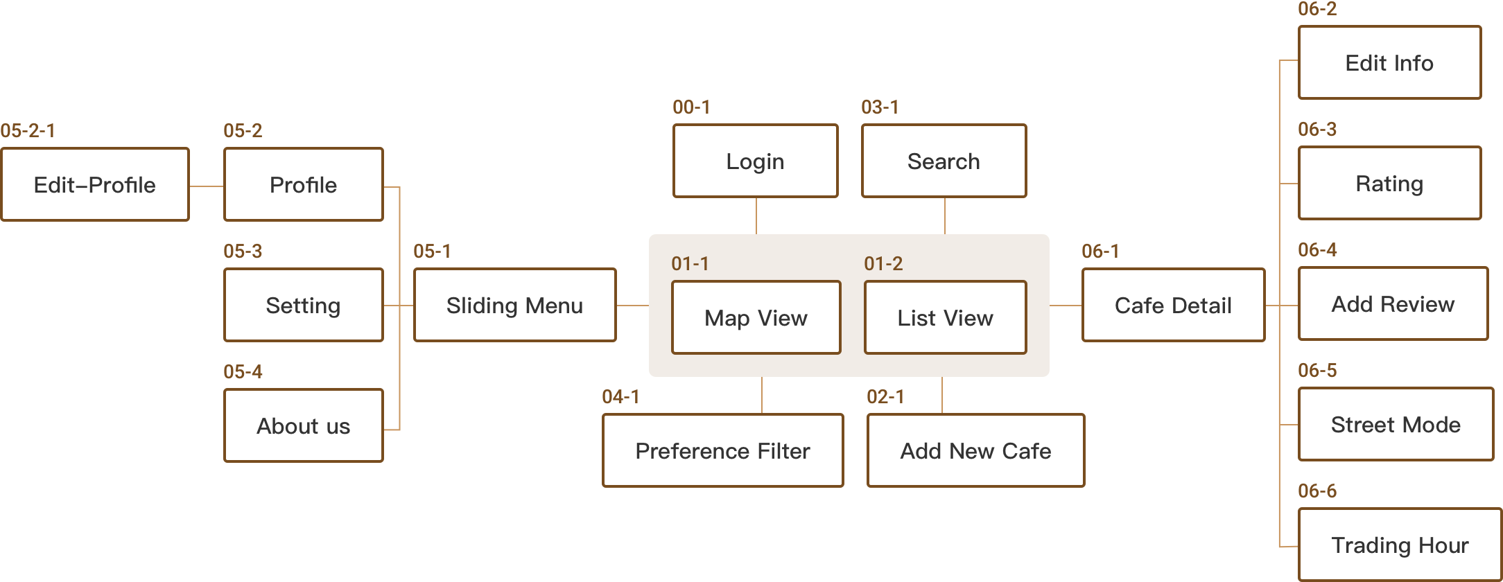
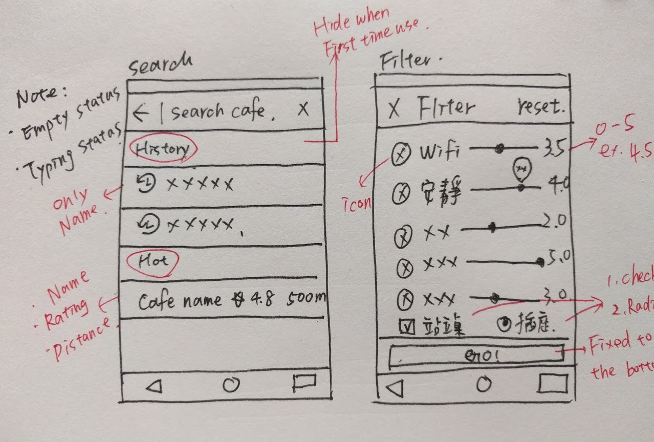
Before we conduct visual design and arrange layout, we need to list all functions of product and number them, also name and plan into a complete information architecture with the spec documents for use, it can be help the whole team to understand the structure of the product quickly, and the basic path between pages in the app.
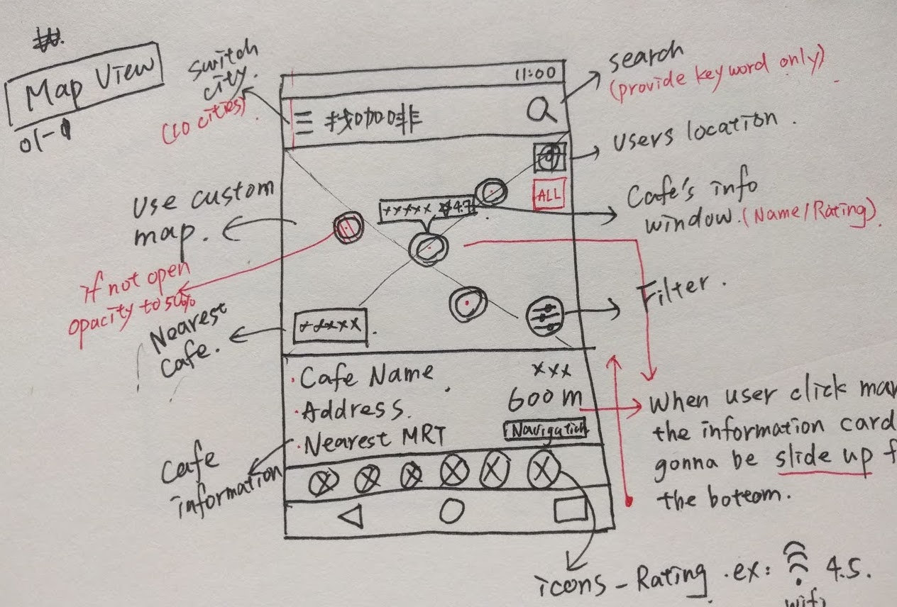
When I finished the basic information architecture, I'm going to conducted rough sketch of interface on the paper quickly, including the layout of the each component and informations that we want to present to the users. Then discuss with the team members to put the right way to the content, then going through the more precise wireframes, make sure that everything follows our plan before doing visual design.
We want to release a version to the users to use as soon as possible(of course, all of our team members are target audience as well), and based on this version to collect more informations and data. So I and engineers spent around 2 weeks to let this MVP launched, all follow our wireframes and information architecture, so the rapid made of a few pages, including our core features like map browsing, keyword search, preference filter.
Click Nearest button
70% of users
Over then 70% of users click the button called“nearest me”to search cafe, means that the use of the situation is mostly outdoors, and for an urgent need to find a cafe. Another interesting finding is that only 4.2% of people click on navigation button, which also means that the navigation button is too small. The data is based on 739 times click events.
Open the App
2.6 times a day
Each user opened the app on average 2.6 times per day, and the daily active users continue to rise, which makes me realize that even if only provides a very simple function, with 20% of the function to solve 80% of people's needs have been very adequate, We also found that most of the user background from the arts, technology and other creative areas, which also reminds us to optimize more details on the app.
Average Stay on App
4 mins
This Minimum viable product only provide the basic message of the cafe, when the user finds the cafe he wants to go, there are left only two options, to leave the app or use the navigation to the cafe. They don't have a strong reason to continue to use this app, so we need to find new ways to increase stay times of the user's, and make more people do communication in the app.
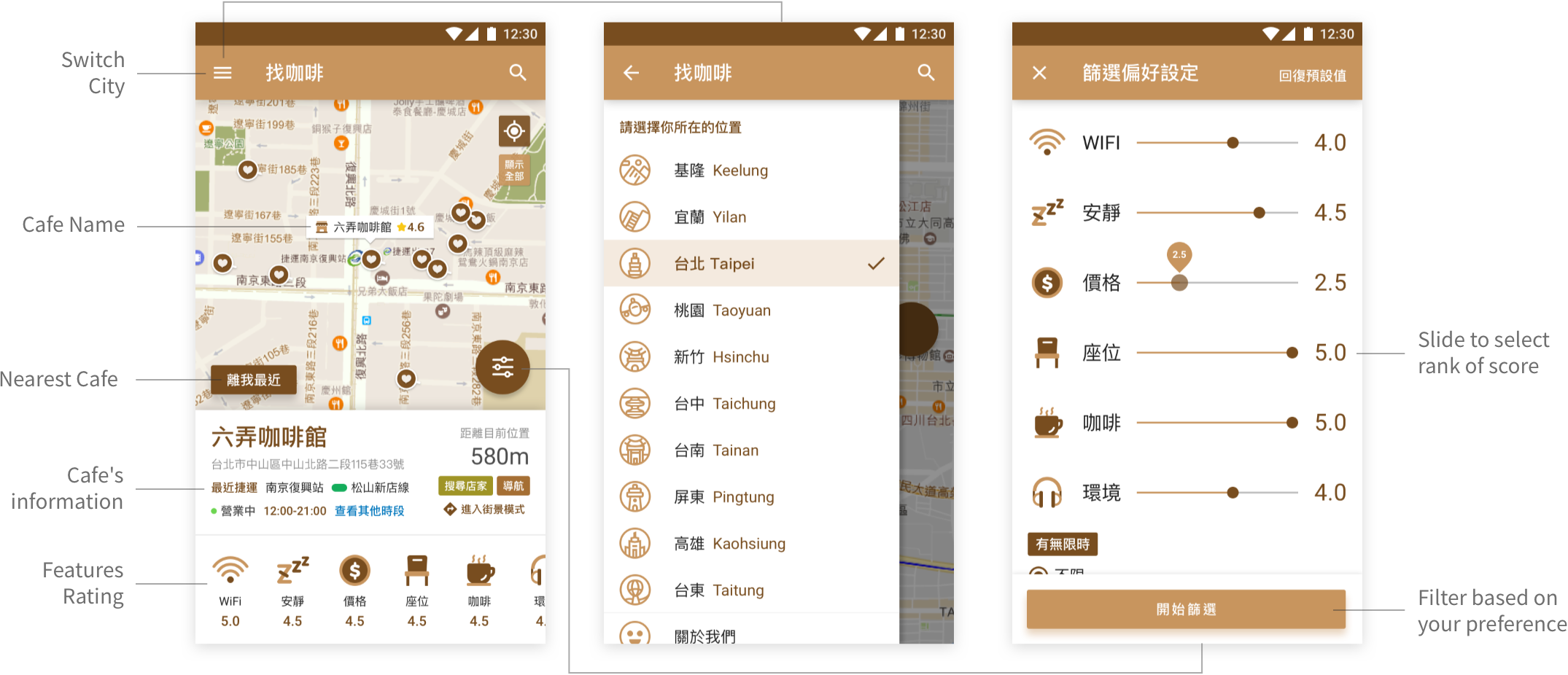
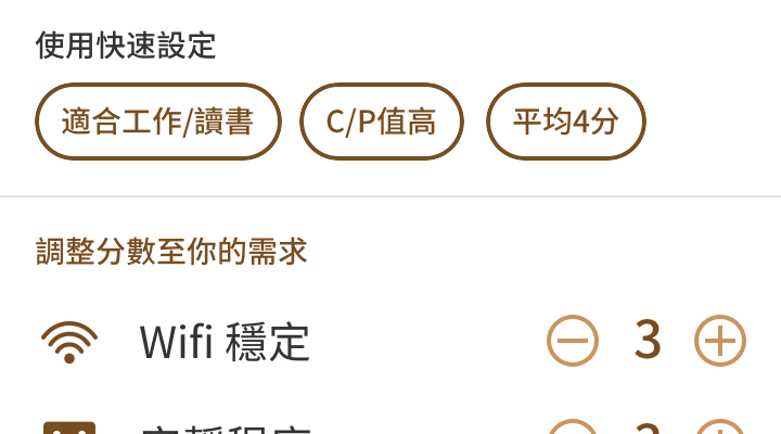
We've added more useful features, which make users can get more information in the product and more opportunities to explore, we support more cities, and you can also add the new cafe in the app, when you are searching can be more easy to select the popular areas, more accurate filter, customer service channel that users can give us the suggest in anytime.
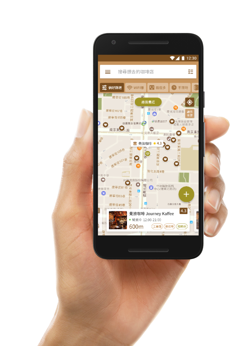
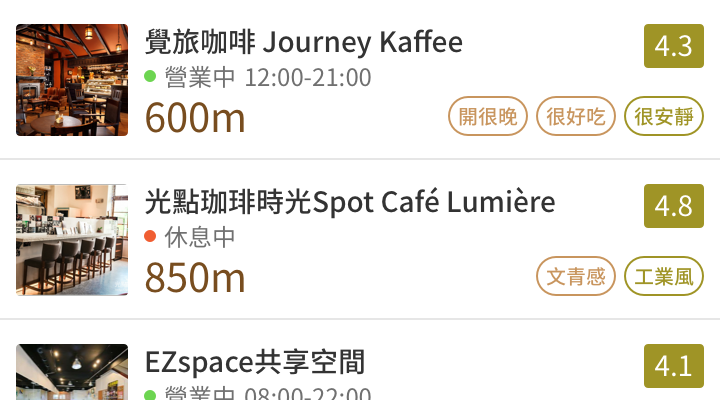
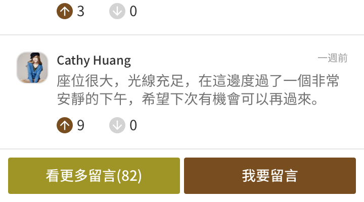
Not only use the map browsing, but also offer a second option: list view, the use of more flexibility, and we also reinforce the information, provide the more detail of cafe informations, photos, users rating, you can really free walking through in the app .
We hope that a lot of people conversation in this product, so we conected the facebook login function, and you can collect your favorite cafe, recording cafe that you have, and even to rate the cafe, leave you commen, and you can know how other users think about this cafe, we expect this product gradually become a big community for the cafe lovers.
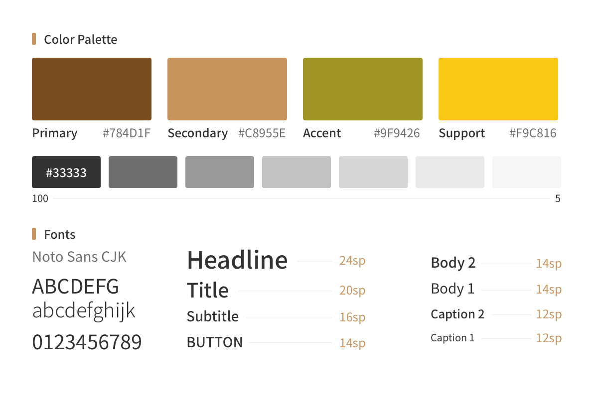
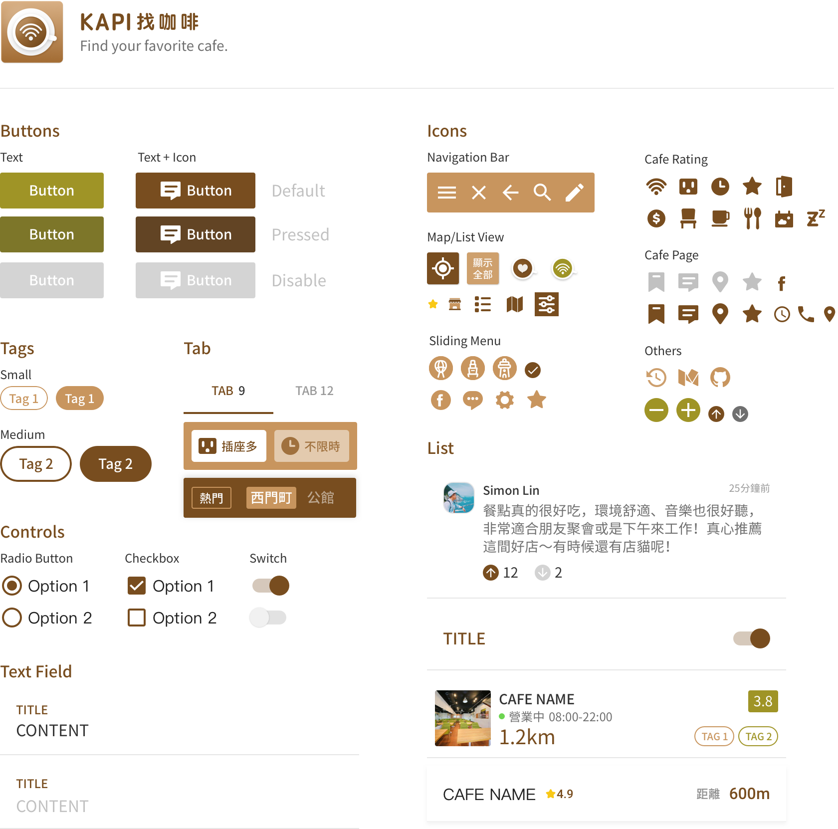
I believe that a good product also has a nice picture of the show, consistent visual language can help users faster immerse to the product, but also a good impression on the brand. In the design system, we focus on three things following: Consistency, emphasize the content, specific call to action , we are not just define the style, while the each component has their own meaning on the view. We followed the Material Design Guideline to design most of our components.
Live Demo
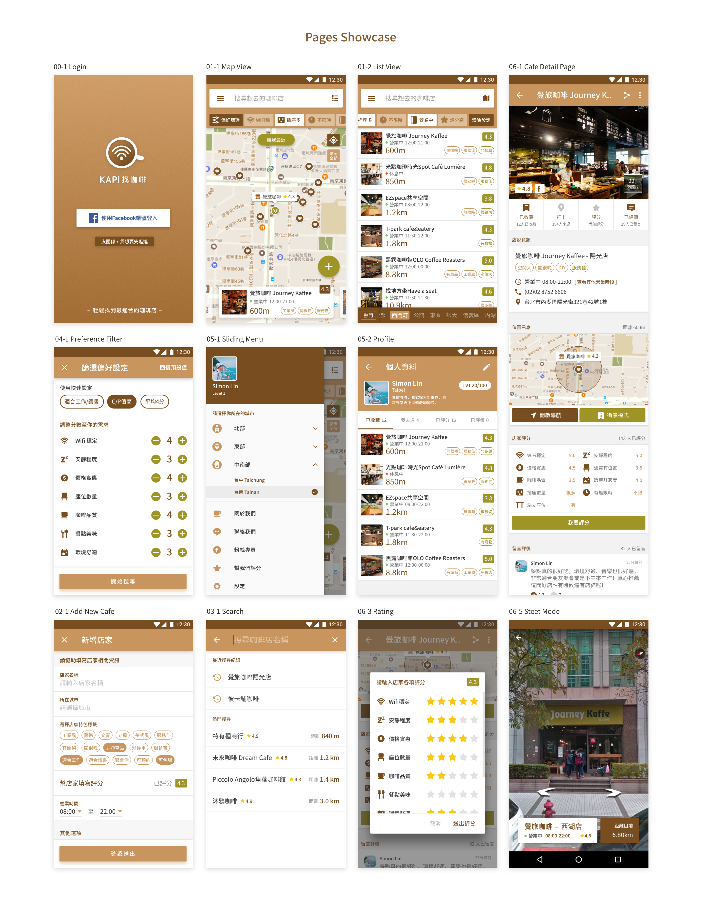
This version provides a very basic feature, including map browsing, keyword search, filters, find nearby cafe, street view, etc., so that users can quickly and easily find a suitable coffee shop through the app.
H-ifi Prototype
This is high fidelity prototype for next version, we added the list view for browsing, also Facebook login, you can collect favorite cafe, give a rating for cafe, and we enhance the user experience optimization, the filter becomes more accurate , and support to 17 cities.
In the execution of this product from the concept to the reality, I learned 3 important things following: create value, accurate design execution and teamwork, the first one is to create value: I want to creat a meaningful design, to help people change their life, so I give the priority of the value from the users to think about my design. The second point is the precise design, the design must have a logical and behind the reasons, your design can be touched through the users, the third is cooperated with team members, continuous communication and try to help the whole team move forward. Finally, when the product launched, I walk on the street, turn on my phone, using the app that we created, the feeling is very good because I'm really solve some problems by design andhelp my my life really different.